This week we’re trying something new at Union & Blue: ask us anything. Via our social media channels we’ve given Jacket fans around the world to ask the questions that are on their mind, for us to answer in detail. We’ll look to do this regularly as we move ahead, but for now let’s get started.
"Via Twitter, Mike in Nebraska asks: Is it time for a new uniform design? Not talking about changing the crest or anything like that, but the #CBJ have had the same basic sweater design for over a decade now."
Great question. This is certainly not something I would typically write about, but it is something that I’m sure we’ve all thought about over the years. I actually like the uniforms as they are right now, with some minor changes I’d like to see.

First, I’m one of the people who thinks the swirled Ohio State flag logo in the shape of the letter “C”, wrapped around a star, is fantastic. I love the simplicity of it, and I do think that in time it will turn into something that is iconic with the city of Columbus. Think of it like the spoked “B” that the Boston Bruins have. In that regard, I agree with Mike that the crest is fine as it is.
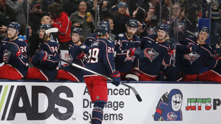
The design of the uniforms themselves is also pretty simplistic, which is great because it gives them a clean, easy to identify look; but the one thing I’ve never liked is the red pants. I get that they’re that way to break things up, so they aren’t in Union Blue from head to toe … but I don’t like them. For this reason, I think a re-design of the home uniform as a whole, that eliminates the red pants, would be fantastic.

I’m not an artist or graphic designer, but I think it would be cool to see them incorporate more of the red/white on the jerseys themselves, and roll with the blue pants at home. Look at the image above and how clean the road uniforms are with the blue pants. In my opinion, these are about a million times better than the old away uniforms, and it’s the pants that make all the difference.
I do like the look of the new reverse retro, but only when I’m seeing the whole uniform. I don’t particularly care for the jerseys on their own. Maybe going with more of a black/blue theme like that could be something to work around? Or, perhaps they could go Union Blue all the way down, and break it up with some striping along the way.
